Workflows·7 분 소요
참조 이미지 한 장으로 무수한 레이아웃: GPT Image 2 템플릿 워크플로
캘린더·캐릭터 카드·제품 페이지·SNS 키트——참조 한 장으로 한 세트를.
템플릿 사고방식
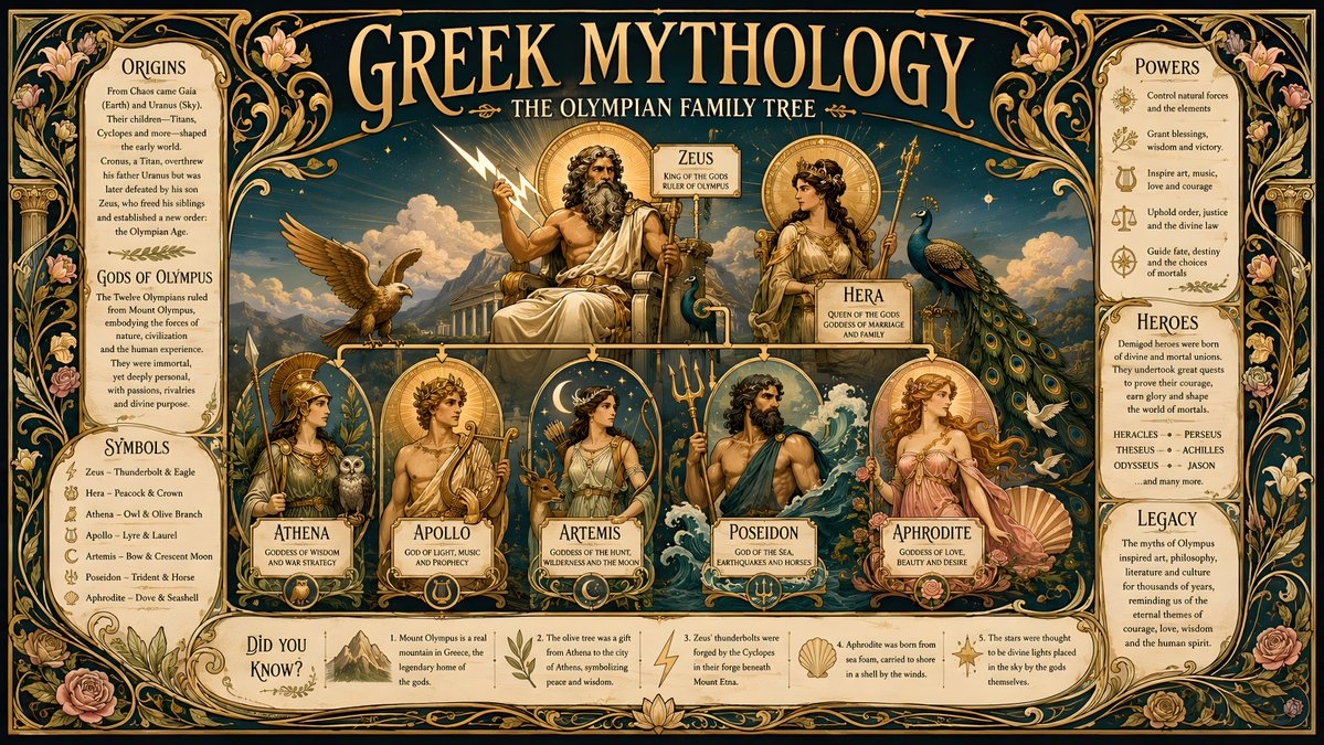
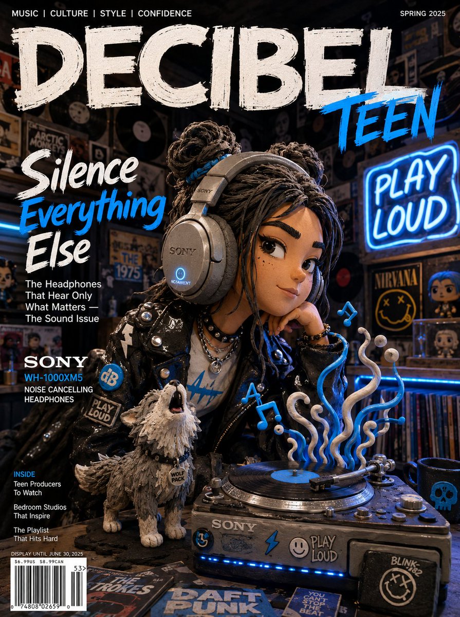
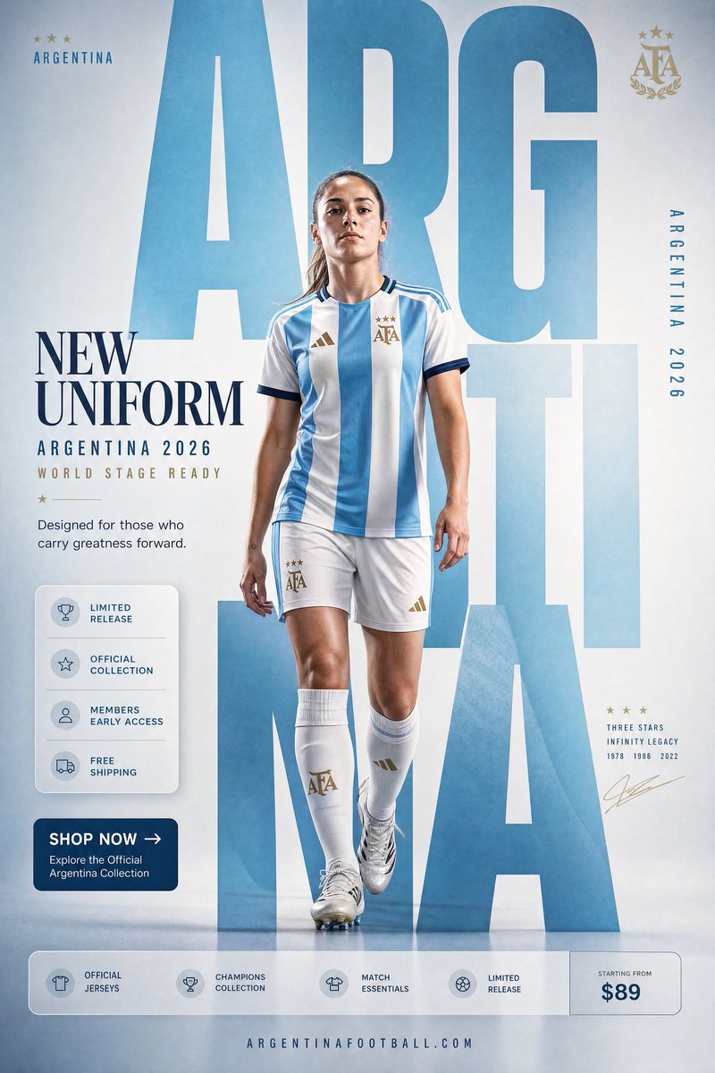
대부분의 사람은 참조 이미지를 장면 교체에 사용한다. 더 큰 레버리지를 내는 방법은 피사체를 유지한 채 그 주변에 구조화된 레이아웃을 입히는 것이다——캘린더, 사양서, 프로필 카드 등. GPT Image 2는 구조화된 그래픽 레이아웃에 유난히 강해서, 참조 이미지에 레이아웃 사양을 더하면 완성품 같은 에셋이 한 번에 나온다.
멘탈 모델: 참조 이미지가 정체성을 공급하고, 프롬프트가 템플릿을 공급한다. 템플릿의 기하 구조가 명확할수록 출력이 더 쓸 만해진다.
캘린더와 날짜 레이아웃
참조 사진은 테마가 있는 월간 또는 연간 캘린더가 될 수 있다. 포맷과 그리드를 명시하지 않으면 모호한 날짜 띠가 붙은 포스터를 얻게 된다.
Use the provided reference photo to create a single-page desktop calendar for the year 2027. Format: A4 vertical. Keep the subject from the reference as the hero artwork at the top half. Bottom half: a clean 12-month mini-grid, readable month names, consistent typography, generous margins. Soft cohesive color palette drawn from the reference. No watermark.캐릭터 & 프로필 카드
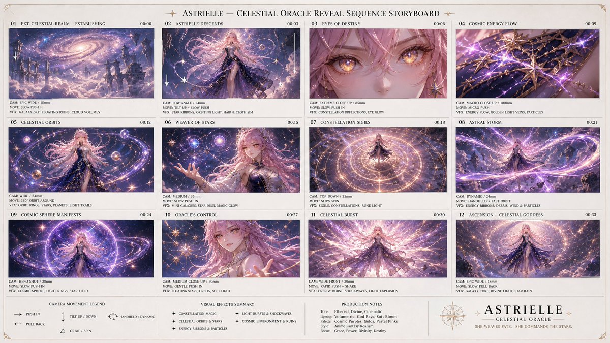
한 장의 캐릭터 참조 이미지는 게임 스타일의 캐릭터 시트나 스탯이 있는 프로필 카드가 된다——게임 아트와 아바타 시스템에서 인기 있는 용도다.
Using the provided character reference, build a character profile card. Keep the face, hair, and outfit 100% identical to the reference. Layout: large character portrait on the left; on the right a tidy info panel with labeled fields — Name, Age, Height, Role, and three short trait lines. Clean game-UI styling, consistent icon set, neutral background, no real brand logos.제품 사양서
제품 사진을 산업 디자인 프레젠테이션 시트로 바꾼다: 여러 각도, 컬러웨이, 디테일 콜아웃을 정돈된 보드 한 장에. 핵심 지시: 제품을 잠가서 알아볼 수 있게 유지할 것.
Using the provided product photo, create an industrial-design presentation sheet. Keep the product identical (shape, proportions, label — do not redesign). Grid layout: top row of 3 detail macro shots, middle row of 3 colorway hero shots (matte black, white, accent), bottom a dynamic floating composition showing front and side profiles. Minimal neutral studio background, soft contact shadows, clean callout lines, premium product-photography aesthetic.소셜 미디어 키트
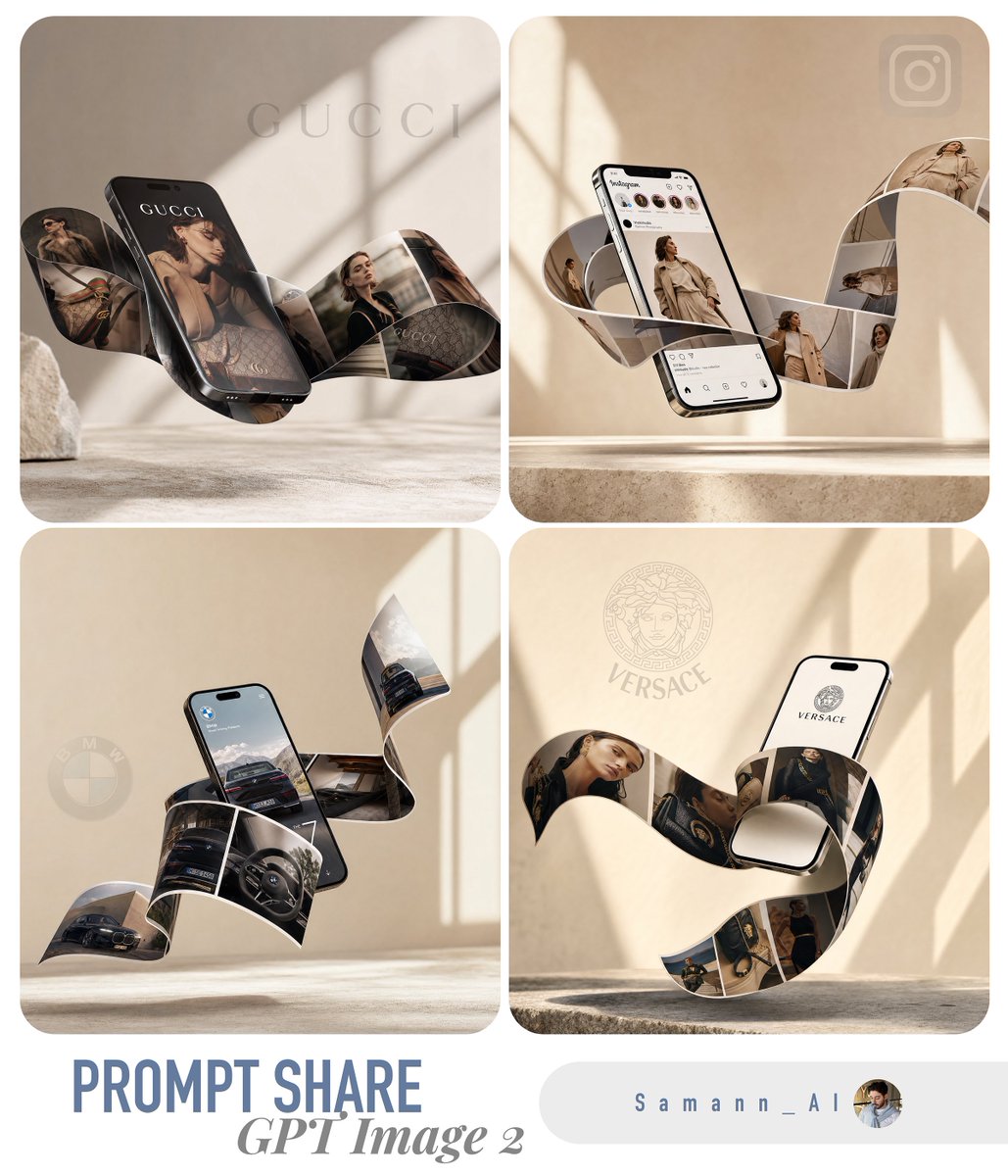
참조 이미지 한 장으로 통일된 다중 포맷 세트——피드 게시물, 스토리, 배너——를 생성할 수 있다. 모두 같은 피사체와 처리를 공유하므로, 배치 위치가 달라져도 브랜드가 시각적으로 일관된다.
Using the provided reference, produce a 3-up social media kit on one canvas: (1) a 1:1 feed post, (2) a 9:16 story frame, (3) a 16:9 banner. Same subject, same color grade, same typographic style across all three; only the crop and text placement change. Label each format with a small corner tag. Leave clear safe-area margins for platform UI.템플릿을 망가뜨리는 것
- 레이아웃이 어긋남 → '캘린더'만이 아니라 정확한 포맷과 그리드(A4 세로, 12개월 미니 그리드)를 명시
- 제품이 재설계됨 → 어떤 제품 템플릿에도 'do not redesign or relabel'을 항상 추가
- 텍스트가 깨짐 → 이미지 위 텍스트는 짧고 명시적으로 배치. 긴 문단은 안정적으로 렌더링되지 않음
- 밀집된 레이아웃에서 정체성 상실 → 'identical to the reference' 잠금을 반복하고 주요 요소를 크게 유지
- 세트 간 불일치 → 다중 포맷 키트는 별도 실행이 아니라 하나의 프롬프트/캔버스에서 생성
Try these GPT Image 2 prompts