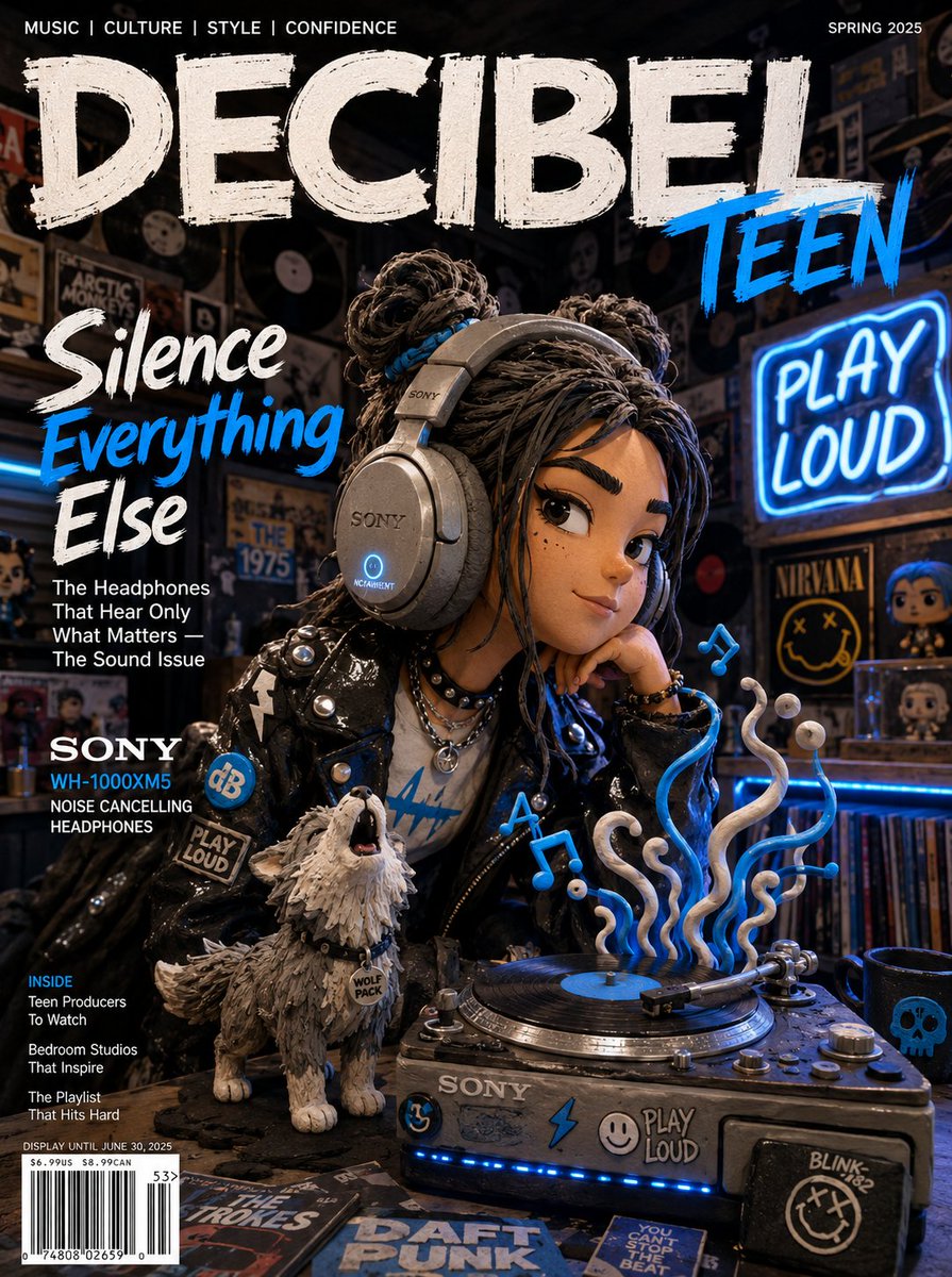
用 GPT Image 2 做电商视觉:产品主图、场景图与详情页 KV
把 prompt 当成拍摄 brief,而不是关键词堆叠。方向性布光、点名材质、预留文案空间,让 GPT Image 2 成为快速、调性统一的产品出图流水线。
把 prompt 写成 brief,而不是关键词堆叠
GPT Image 2 在商业场景里最鲜明的特质是极强的 prompt 服从度:你告诉它机位角度,它就守住;你告诉它要留掉什么,它就留掉。反过来说,一个含糊的需求——「给我产品来张好看的照片」——只会得到一张通用、平淡的结果。你投入多少结构,模型就回敬你多少结构。
所以要按固定顺序把 prompt 写成一份拍摄 brief,这个顺序对应 OpenAI 公开的 prompting 指南:先场景/背景,再主体,再关键细节,最后约束。把任务明确说出来——「一张电商 hero 图」或「一支高端产品广告」——因为点明用途比「漂亮」这类形容词更能把模型的精致度和构图定到位。
一个可靠的骨架:主体 + 环境 + 布光 + 材质 + 构图 + 用途 + 约束。你不会每次都用满每一个槽位,但用槽位去思考,能让你不再一股脑塞十个风格词、指望蒙中一个。
这也改变了一次拍摄的经济账。与其一天产出五张成品,不如探索五十个方向——背景、角度、情绪——挑出胜出者,然后才在精修上投入。prompt 是你的 brief;模型是一位不知疲倦的初稿摄影师。
看起来不假的背景与布光
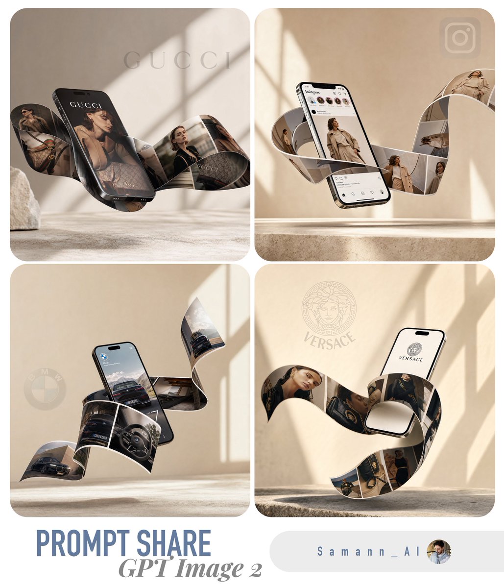
按渠道来选背景。纯白(RGB 255,255,255)、产品占画面约 85%,是 Amazon 这类平台所期待的样式。浅灰无缝背景纸对 DTC 品牌读起来更高端。场景图则需要真实的环境和自然光。把你想要哪一种说出来——别交给运气。
布光是 AI 图最先翻车的地方,而解法是给方向,不是给形容词。「柔和而戏剧性的光」对模型毫无意义;一个光线向量才管用:
three-point lighting setup, strong key light from camera-left at 45 degrees, soft fill from the right, subtle rim light separating the product from the background这些都是模型在真实产品照片里见过、与之绑定的专业摄影术语,所以它们会从训练分布里正确的那一部分提取内容。用 rim light 去勾勒高光感强的电子产品边缘,用柔和的散射光拍护肤与彩妆,并且永远点名光从哪来。
干掉塑料感:材质、阴影、纵深
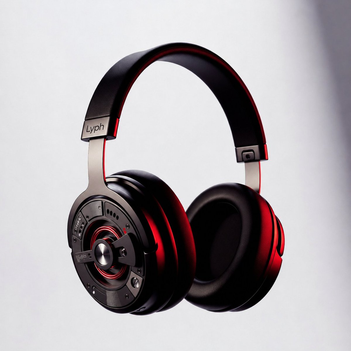
一张 AI 产品图最大的破绽就是假材质。把材质明确点名,表面就不再像注塑塑料:
- 金属:「visible brushed-metal grain, realistic metallic reflections」
- 布料与箱包:「realistic nylon texture, visible stitching and zipper detail」
- 食物:「natural oil sheen, real surface texture, condensation droplets」
- 深色背景上的高光物件:「crisp edges, subtle reflection underneath」
让产品落地,别让它漂浮。接触阴影是最廉价的真实感升级:「subtle realistic contact shadow directly under the product.」然后点名三个纵深层次——前景产品、中景道具、柔焦背景——来打破那种平贴上去的观感,让画面有真实的空间。
Hero KV:为文案预留空间,锁定文字
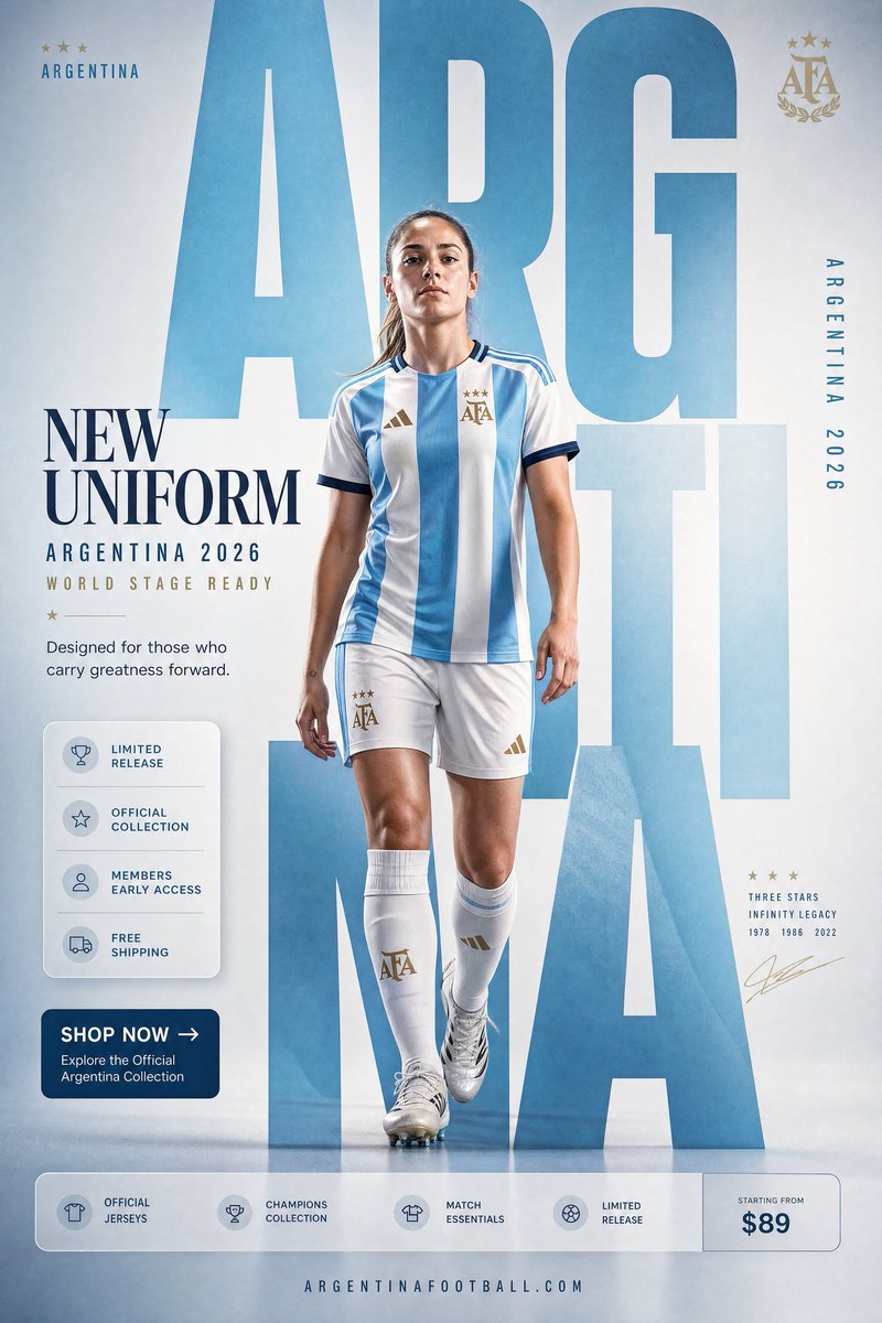
hero KV(key visual)是一张专门为承载标题而构建的产品图。从第一条 prompt 起就把它设计进构图里,而不是事后再裁剪:「product on the right, clean negative space on the left for a campaign headline.」
GPT Image 2 能渲染出真实、可读的文字——相比老模型是一次实打实的飞跃——但前提是你把它锁死。把确切的文案放进引号,给每一块文字命名角色,并禁止多余内容:
Headline (top-left, render verbatim): "SOUND YOU CAN FEEL". Subhead below it: "40-hour battery". No extra words, no duplicate text, no fake brand logo, no watermark.如果文字糊了,就减少字数、加大字号,并重新加上「render verbatim, exact text only.」对任何关键到不能出错的内容,生成时就把文字区域留空,事后在设计工具里排版上字——这能保证拼写和字距完美无瑕。(对数据图表这类文字密集的版式,参见我们关于信息图与文字渲染的指南。)
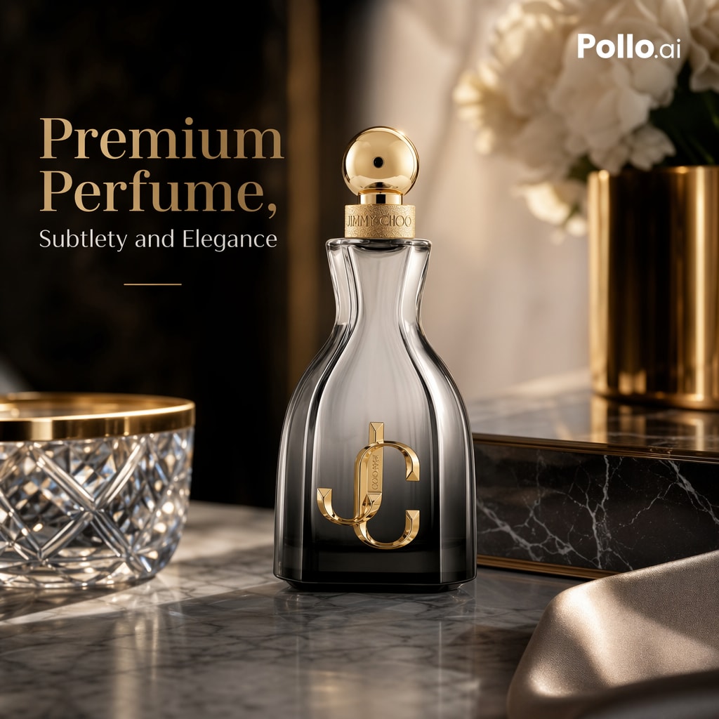
三个可以马上粘贴使用的模板
平台主图——纯白、边缘锐利:
A clean e-commerce packshot of [product], centered on a pure white seamless background (RGB 255,255,255). Keep the exact shape, proportions, branding, label text and material finish. Product fills ~85% of the frame. Soft diffused three-point studio lighting, subtle realistic contact shadow directly under the product. Straight-on angle, sharp crisp edges, realistic reflections on glossy surfaces. No props, no extra objects, no text overlay, no watermark, no distortion.场景图——温暖、有生活气息,产品仍是主角:
A lifestyle e-commerce photo of [product] on a marble surface (foreground), a book and phone nearby (mid-ground), a softly blurred warm interior (background). Morning light from a left-side window, soft natural shadows. 35mm lens, eye-level, shallow depth of field. Keep the product design, branding, proportions and material exactly; the product remains the hero. Minimal, editorial, believable lighting. No clutter, no text.带标题的 hero KV——16:9、预留文案空间:
A premium e-commerce hero KV for [product] on a concrete plinth, 16:9, product on the right with clean negative space on the left. Headline (verbatim): "[YOUR HEADLINE]". Subhead: "[short benefit]". Render all text verbatim, perfectly legible, no extra words, no duplicate text. Dramatic rim light, sharp product edges, subtle clean contact shadow, luxury campaign style. Preserve product shape, label text, color and material exactly. No fake brand logo, no watermark.只替换方括号里的几行,整本目录的观感就能保持一致——这和参考图工作流背后那套锁定模板的思路是一样的。
坑点——以及真实拍摄仍然胜出的地方
大多数失败模式都有一句话的解法:
- 塑料表面:点名材质并加上「realistic texture, real imperfections」。
- 平淡、发闷的光:给一个光线方向和一套真实的布光,绝不要只写「cinematic」。
- 文字乱码或重复:减少字数、加大字号,引号外加「render verbatim, no extra words」。
- 产品悬浮:「subtle contact shadow directly under the product」。
- 编辑时跑偏:「change only X, preserve everything else exactly」,并锁定机位角度。
- Logo 或商标风险:先用一个虚构但清晰可读的品牌标识来设计,事后再合成真实 logo。
对极限要诚实。GPT Image 2 在概念探索、创意 A/B 测试,以及目录图和场景图上都极为出色。但细节至关重要的品类——珠宝的刻面与金属反光、带接口和屏幕的电子产品、有织纹和垂感的织物——仍会让它栽跟头,而奢侈品的 hero 画面往往最好真拍或交给修图师收尾。用模型来跑得快、覆盖量大;把相机留给那少数每一个像素都会被审视的画面。
想试试?本站的 GPT Image 2 免费起步——注册送 20 个 credits,无需绑卡。在 gpt-img2.com 生成你的第一批产品图,当你要放量时,加购 credits 的价格大约是 OpenAI 官方图片价格的一半。浏览电商 prompt 示例。
Try these GPT Image 2 prompts