GPT Image 2 for Marketing Posters & Banners: Headlines, Layout & CTAs
Older models painted text as texture and misspelled it. GPT Image 2 treats type as a layout element — so with the right prompt you can ship campaign posters with headlines, subheads and CTAs that actually read.
Why GPT Image 2 changed poster-making
Earlier image models drew text by copying letter shapes as if they were texture, which is why "WELCOME" so often came back as "WELCMOE." GPT Image 2 treats text as a layout element: it keeps grid logic and letterforms, holds kerning, and stays consistent across a block of type. That is the difference between a decorative squiggle and a headline you can actually publish.
Third-party tests put first-pass text accuracy above 95% when the copy is locked in quotes — versus 60-70% on older models — and the same tests show why: without quotes, a word like "WELCOME" came out right only about a third of the time; in quotes it jumped to roughly 89%. (These are early third-party benchmarks, not an official figure, but the direction is consistent everywhere.)
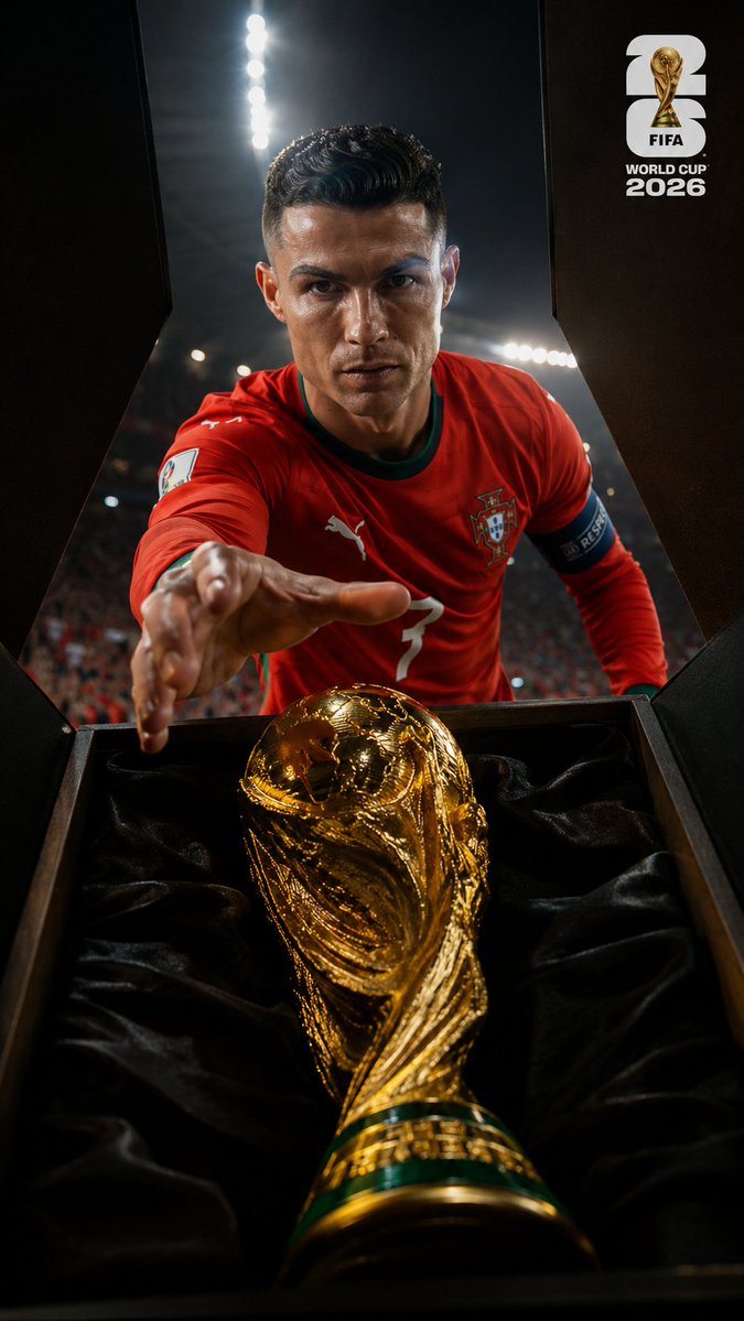
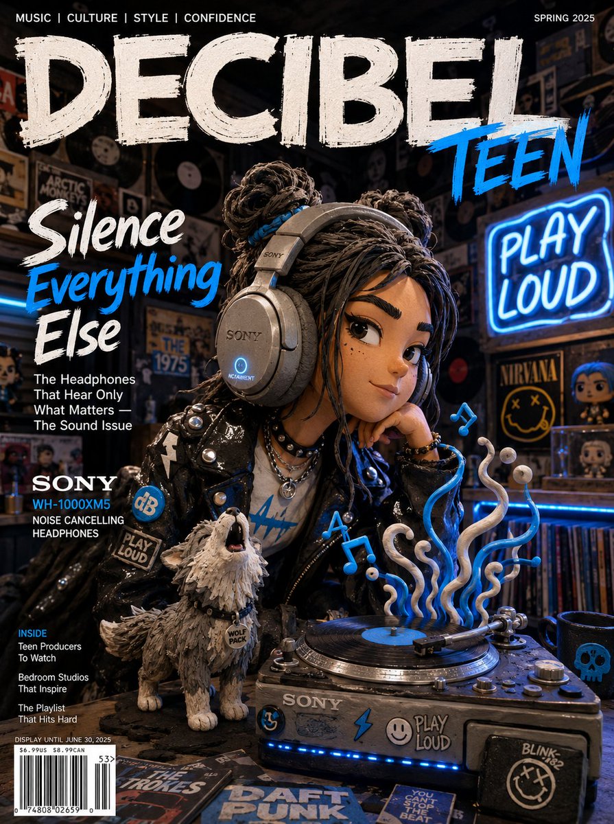
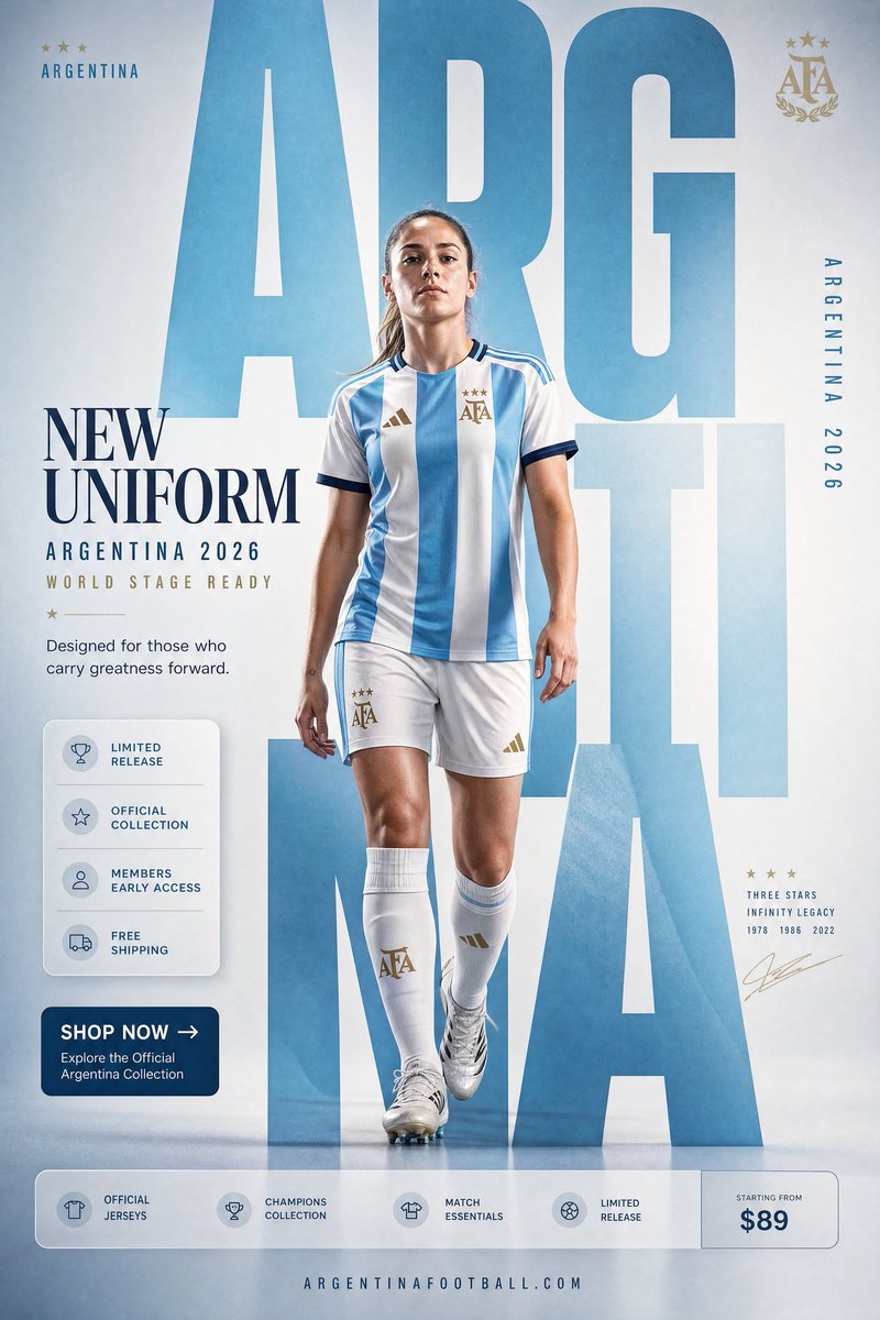
That unlocks a real use case: marketing posters and ad banners with working headlines, subheads and call-to-action buttons — not just pretty backgrounds you have to typeset over later.
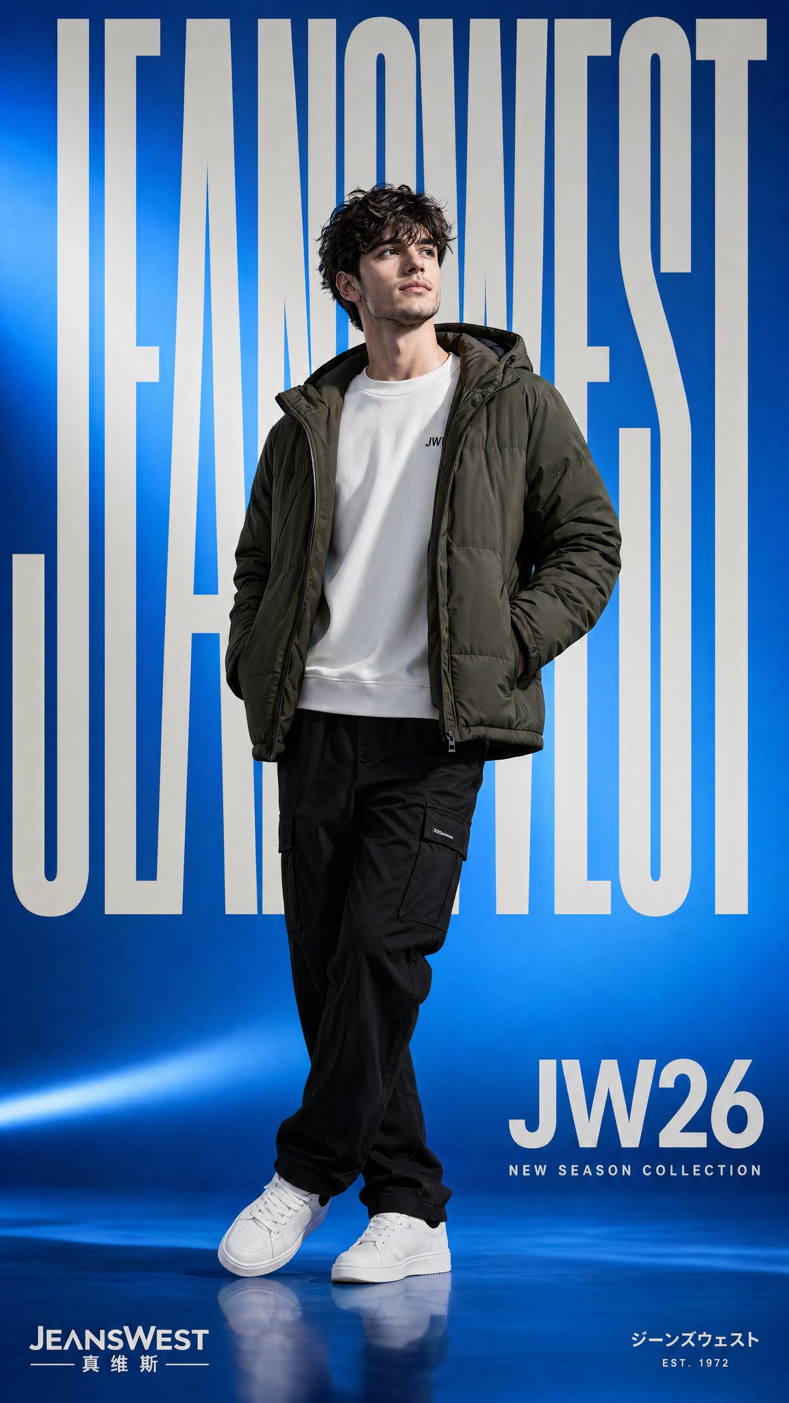
The quote rule, and naming every text block
Rule one: anything that must appear exactly goes in double quotes, tagged verbatim. Everything outside quotes is a hint; everything inside is a contract.
Include only this text, verbatim: "FRESH AND CLEAN". No extra words, no duplicate text.Rule two: name each text block by its role so the model lays out a real hierarchy instead of one undifferentiated blob. Posters usually need two or three named levels:
Headline (EXACT TEXT): "SUMMER SALE"
Subhead (EXACT TEXT): "Up to 50% off, this week only"
CTA button label (EXACT TEXT): "SHOP NOW"
Constrain each block's font weight, relative size and alignment separately — a heavy condensed sans for the headline, a light sans for the subhead, the CTA on a high-contrast pill. For an unusual brand name or spelling, spell it out letter by letter in the prompt to push character accuracy higher.
Layout, hierarchy and negative space
Describe the layout before the style. Tell the model where each element sits and how much room to leave:
- Position with direction words: "headline top-left, product on the right, logo top-right".
- Demand breathing room explicitly: "generous negative space, uncluttered" — it prevents the cramped, over-stuffed default.
- Pin alignment and rhythm: "centered, clean kerning, consistent baseline grid".
- Set high-contrast color so type stays legible: "cream background, navy headline, one red accent on the CTA".
Keep mission-critical copy short: one to four words per block renders most reliably, and adding "no reflow unless necessary" stops the model from rewrapping your lines into nonsense.
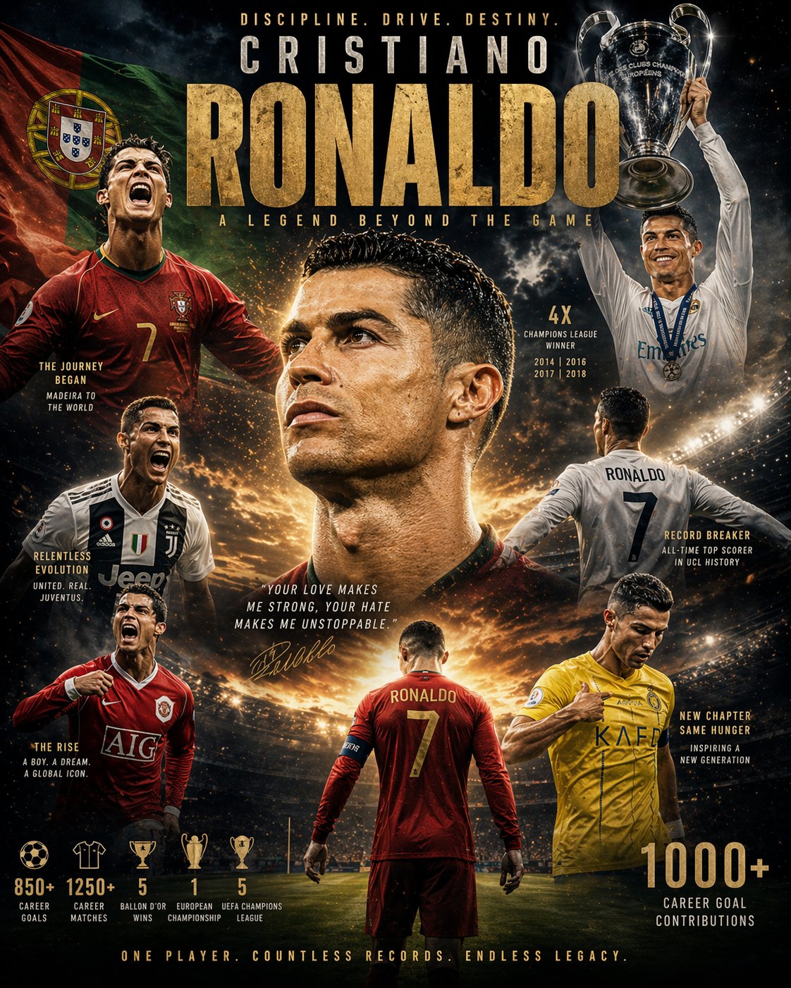
Three poster templates you can paste
Event or promo poster — headline, subhead and CTA:
Event promotion poster, 2:3 vertical, high quality. Layout: bold headline at top, subtitle below, CTA button near the bottom, generous negative space. Headline (verbatim): "SUMMER SOUND 2026". Subtitle (verbatim): "Aug 15-17, Riverside Park". CTA button (verbatim): "GET TICKETS". Headline in bold condensed sans-serif, subtitle in light sans-serif, CTA on a high-contrast pill button, clean kerning, centered. Neon purple-to-pink gradient background, white text, high contrast. Render all text verbatim, no extra words, no duplicate text, text perfectly legible.Minimal product banner — 16:9:
Minimalist product banner, 16:9, high quality. Layout: product on the right, text block on the left, lots of empty space. Headline (verbatim): "PIXEL PRO 2026". Tagline (verbatim): "See more. Think less.". Large bold sans-serif headline, small light tagline beneath, left-aligned, clean kerning. Clean white background, charcoal text, one accent color on the product. Text verbatim, appears once, no extra words, no duplicate text.Multi-level layout poster — dense and ordered:
Schedule poster, 3:4 vertical, high quality. Layout: title bar at top, three labeled sections below, footnote at bottom. Title (verbatim): "DESIGN WEEK 2026". Section labels (verbatim): "TALKS", "WORKSHOPS", "SCHEDULE". Title in heavy sans-serif, section labels bold uppercase, list items regular sans-serif. Strong hierarchy, left-aligned columns. Off-white background, near-black text, one red accent for labels, high contrast. Render every line verbatim, preserve order, no reflow, no extra words.Anti-garble: pitfalls and the safety net
Even a model this good is probabilistic, so build in guard rails:
- Garbled spelling: keep copy short, raise the size, wrap in quotes with "verbatim".
- Text repeated or invented: add "no extra words, no duplicate text, no additional logos" — the model has a completeness urge and will pad if you let it.
- Small or dense type breaking up: generate at high quality so compression does not eat the characters.
- Lines rewrapping wrong: split long copy into named short blocks and add "no reflow".
And the safety net for anything that must be perfect: batch-generate four to ten variants and pick the clean one, or — for legal lines, prices, long paragraphs — leave that area blank in the generation and set the type in a design tool afterward. The model nails the visual; you guarantee the spelling.
Posters vs infographics — and where to go next
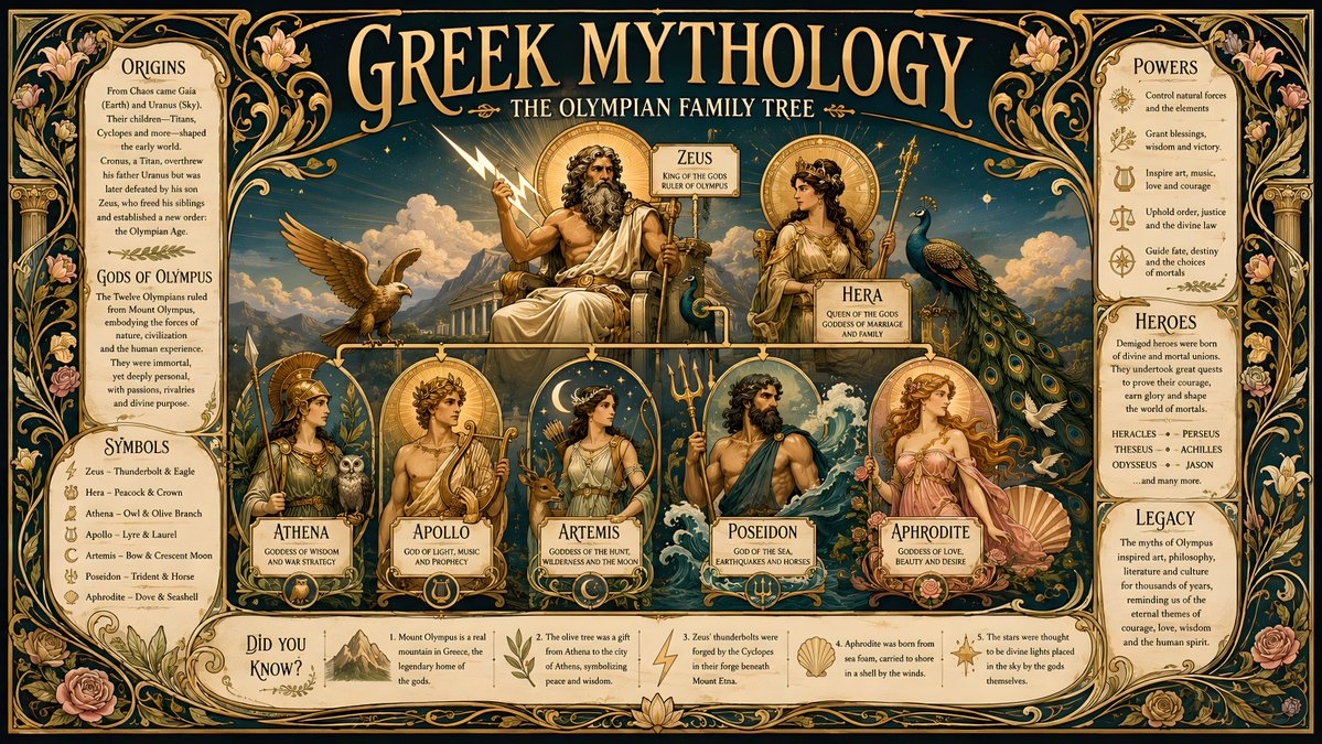
This guide is about marketing creative: a few large, punchy lines, strong visual hierarchy, a CTA. If instead you need text-dense, data-heavy layouts — charts, labeled diagrams, step-by-step explainers — the constraints are different, and our guide on infographics and precise text rendering covers that case in depth.
GPT Image 2 on this site is free to start — 20 credits on sign-up, no card required — which is enough to test a dozen poster variants. Design your first one on gpt-img2.com and browse poster prompts — credits stay a fraction of the official API's per-image cost as you scale.
Try these GPT Image 2 prompts
Try these techniques now
Open the free GPT Image 2 generator and put this into practice — 20 free credits, no credit card.