Art-Style & Editorial Prompting for GPT Image 2
Style is a stack, not a word — control medium, light/color, composition, and era as separate layers.
Style is a stack, not a word
"Make it cinematic" gives the model one fuzzy target and a million ways to miss. Strong style prompting decomposes the aesthetic into independent layers — medium, lighting, color grade, composition, era — and specifies each. The same subject rendered through different stacks is unrecognizable; that control is the whole point.
Think like a director writing a lookbook, not a user typing an adjective. Each layer below is a dial you set explicitly.
Layer 1 — Medium & technique
Name the physical medium and how it's applied. "Watercolor" is weak; the technique detail is what makes it read as handmade:
Handcrafted travel-journal illustration: transparent watercolor washes layered over fine ink linework, visible paper grain, soft bleeding edges, hand-lettered captions. Loose, imperfect, sketchbook feel — not digital-clean.Words like "layered", "visible grain", "bleeding edges", "imperfect" stop the model defaulting to flat digital art.
Layer 2 — Light & color grade
Lighting and grade carry most of the mood. Specify direction, quality, and palette as a unit:
Lighting: low warm side light from the upper left, long soft shadows, gentle bloom. Color grade: muted teal-and-amber, lifted blacks, low saturation, film-like with subtle grain."Teal-and-amber, lifted blacks, subtle grain" reproducibly yields a cinematic feel — far more reliable than the word "cinematic".
Layer 3 — Composition & layout language
Tell the model how to frame, not just what to draw. Composition vocabulary is a strong, underused lever:
- Shot & lens: "intimate medium shot, 35mm, shallow depth of field"
- Balance: "symmetrical, centered subject" vs "off-center, rule-of-thirds, negative space on the right"
- Energy: "calm and minimal" vs "dense maximalist collage with overlapping layers"
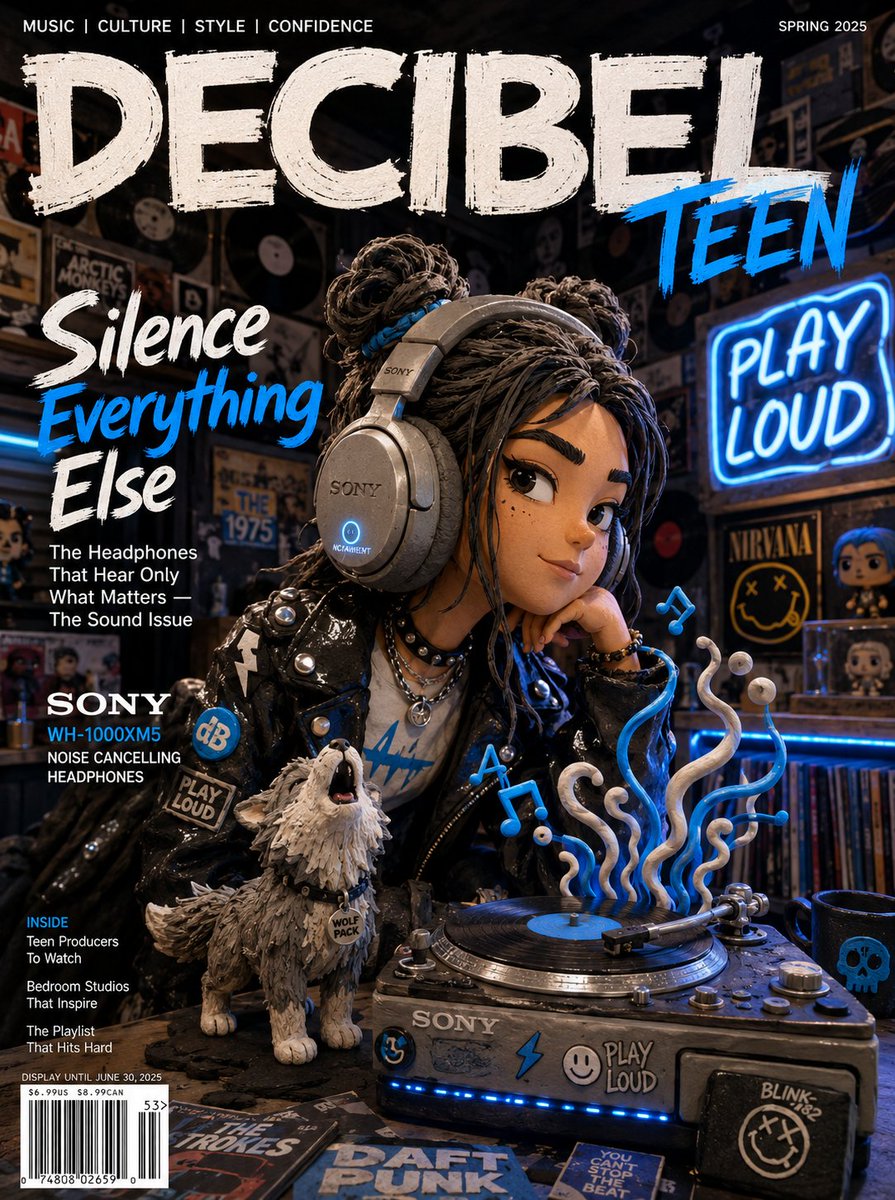
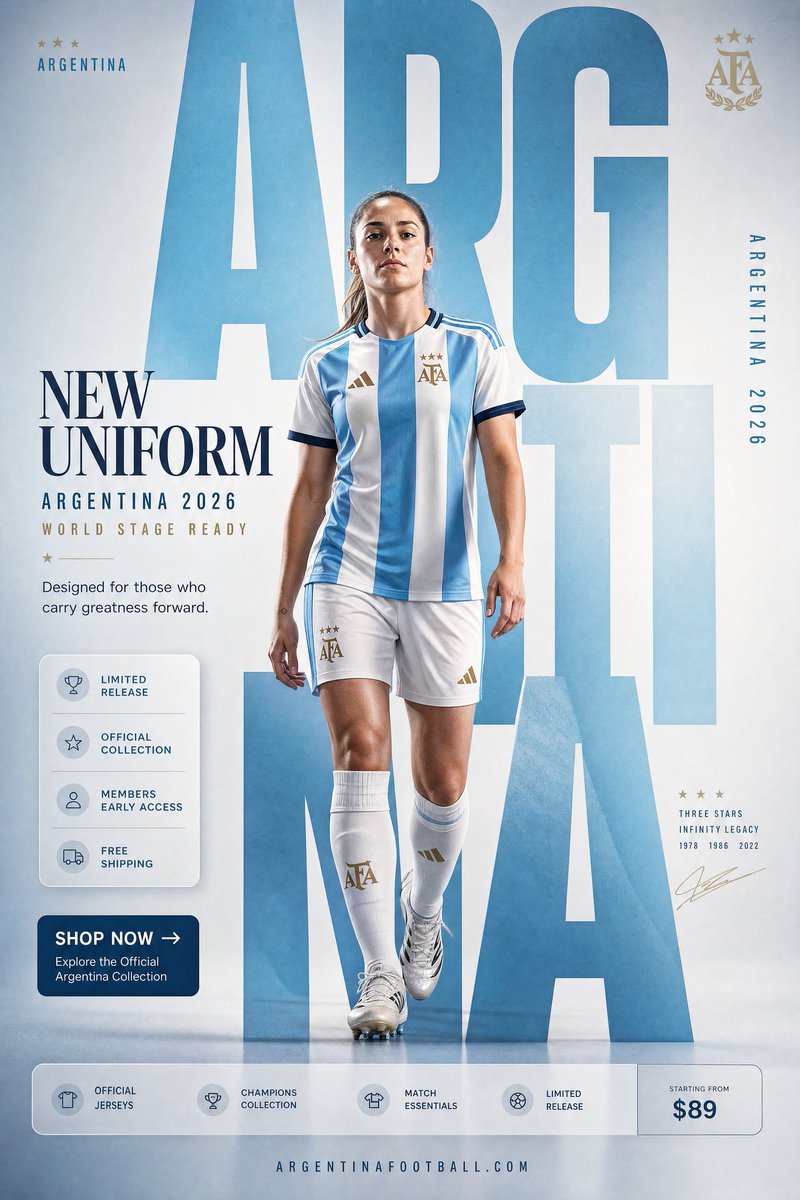
- Editorial cues: "fashion-magazine layout energy, large headline space, sticker-like graphic elements" for editorial/Y2K looks
Layer 4 — Era & cultural reference
Era anchors an aesthetic instantly — but reference the period and movement, not a living artist (legally and reputationally safer for commercial work).
Era cues: early-2000s Y2K pop-street aesthetic — chrome type, glossy stickers, bold primary blocks, low-fi digital print texture. Reference the period and movement, not any specific artist or brand.Negative space & restraint
Strong style is as much what you exclude as what you add. A short "avoid" clause sharpens the look: "avoid: glossy 3D render, oversaturated HDR, generic stock-photo lighting, watermark, text artifacts." Restraint instructions ("minimal, lots of negative space, one focal point") prevent the model's default tendency toward busy, over-rendered images.
A reusable style template
Assemble the layers into a fixed block you paste above any subject and only swap the subject line:
[SUBJECT: a quiet café on a narrow European street]
MEDIUM: transparent watercolor over ink linework, visible paper grain, hand-lettered captions.
LIGHT/COLOR: warm low side light, muted teal-amber, lifted blacks, subtle film grain.
COMPOSITION: intimate medium shot, off-center, generous negative space.
ERA: timeless illustrated travel-journal, no modern UI elements.
AVOID: 3D render, HDR, stock lighting, watermark, garbled text.
Reuse the block, change only SUBJECT, and your output stays visually coherent across an entire series — the same principle as a character anchor, applied to aesthetics.
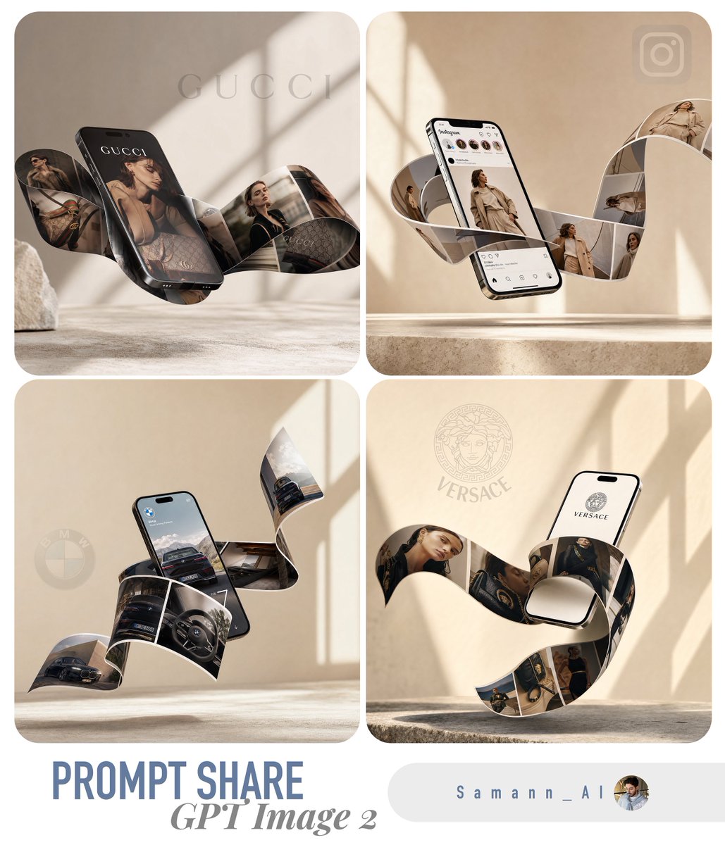
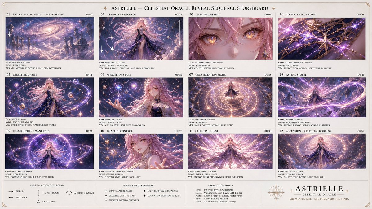
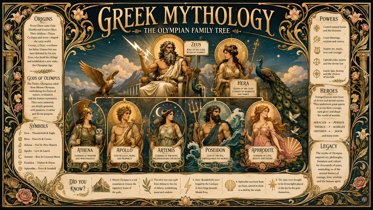
Try these GPT Image 2 prompts

Try these techniques now
Open the free GPT Image 2 generator and put this into practice — 20 free credits, no credit card.